
Troubleshooting Italic – Part 2
In the previous post of the series – Troubleshooting Italic Part 1, we focused on structurally simple Italic letters like i, n, and u. By taking a look at the most common problems, we laid the groundwork for understanding the most important visual ideas of this style.
In this post, we’ll turn our attention to a different group – letters with bowls and enclosed counters: a, d, g, q, b, and p. Some of the problems from the previous post will be back, and some will be specific to this set of letters.
Before we jump in, a quick aside: the problems I discuss are just that – problems, not laws. There are no rules you need to follow if you don’t want to. There’s no calligraphic police that will come for you if you generously space Gothic (please, don’t do this). That said, every design decision has consequences, and being aware of them is just as important as technical skill. Just because crossing two thick strokes adds weight and disrupts the flow doesn’t mean you can never do it. It just means you need to be especially careful when making that kind of decision, because it will lead to a specific outcome.
Case 1 – spacing (again)
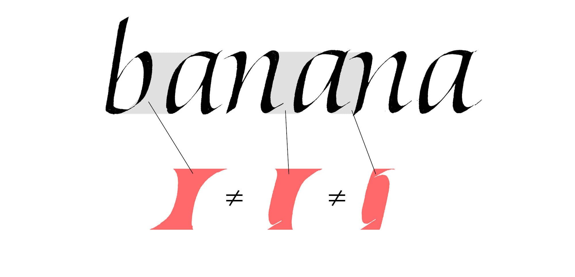
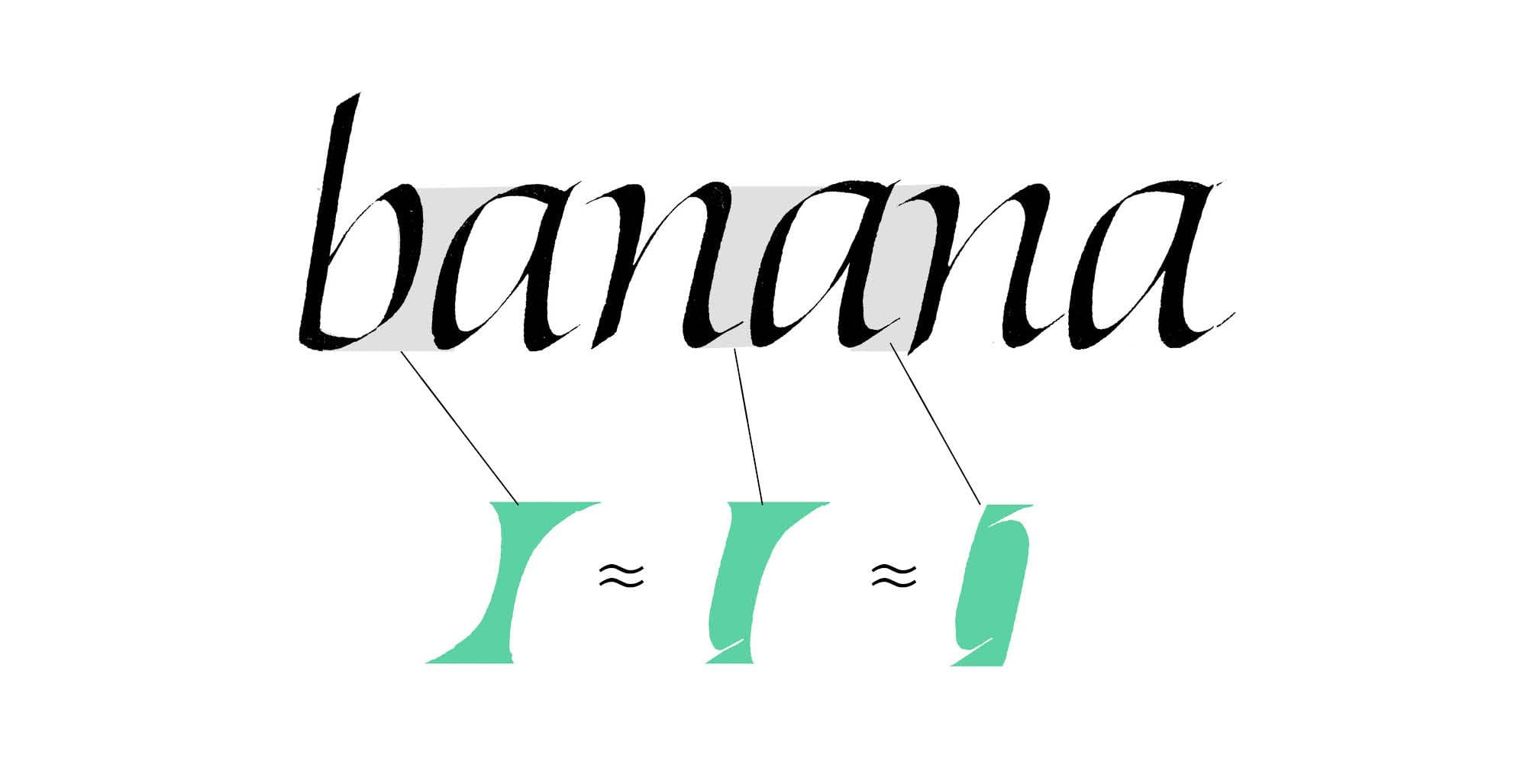
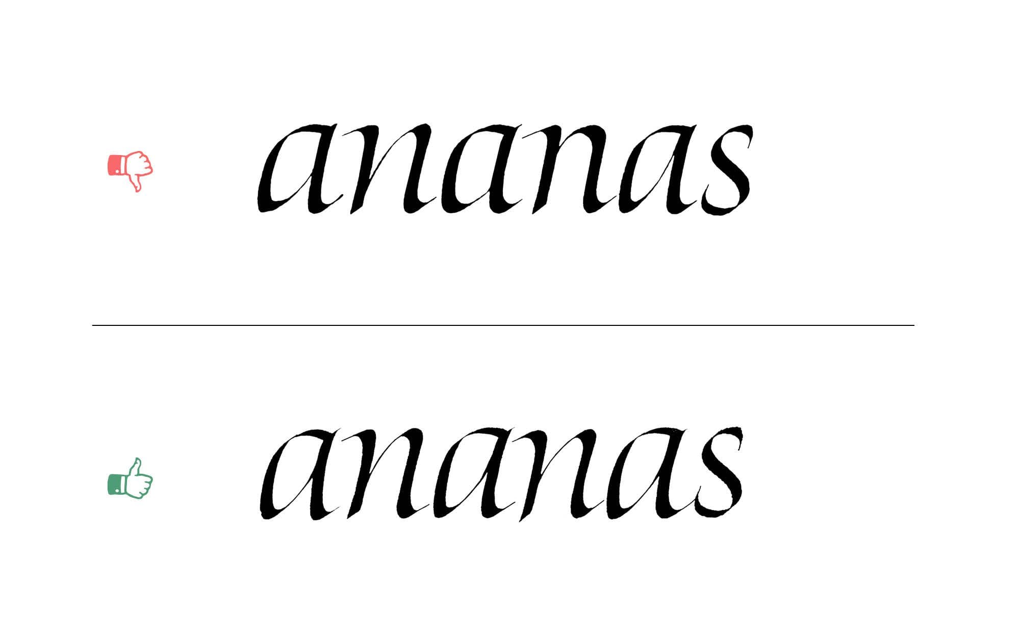
We kicked off the previous post with the problem of spacing, and I stressed its importance. I’d even go as far as to say that if you’re able to evenly space your letters, you’re already ahead of most calligraphers.
In principle, it’s simple: it’s all about creating an even distribution of negative space—the space between and around the strokes. This requires a balance between the counters within the letters and the spaces between them. In practice, it’s one of the most difficult aspects of calligraphy.
Today, we’ll look at a more nuanced example than in Part 1. This time, we’re working with a word that includes the new letterforms with bowls and enclosed counters.
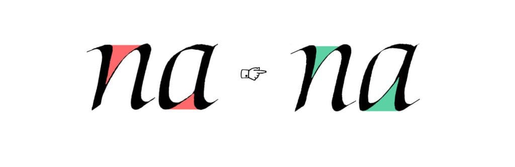
Case 2 – heavyweight intersections
The fix for this one can be tricky. It requires a lot of control: pen angle, pressure, and sometimes even a bit of subtle rotation mid-stroke. So what exactly is the issue, and why does it matter?
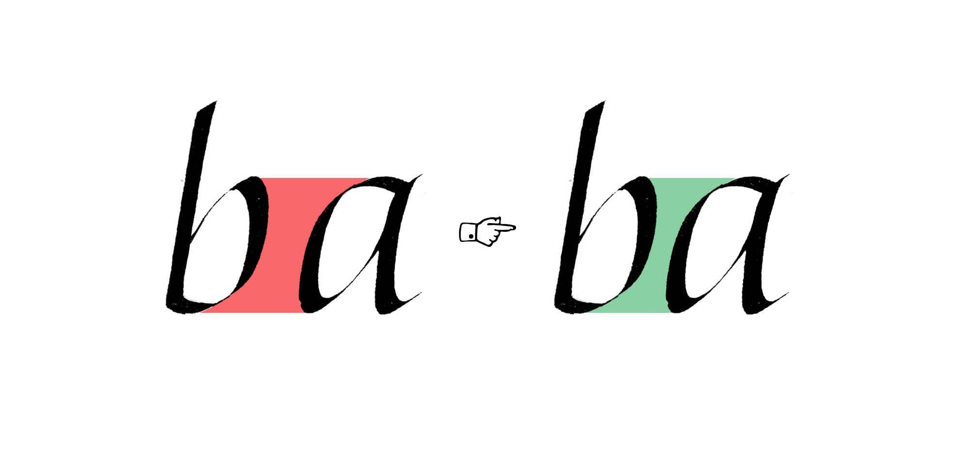
The short version: two thick strokes shouldn’t cross. When they do, they create a heavy, dark spot that pulls the eye and breaks the rhythm of the letter. You should be just as careful when the strokes only meet, like at the top of the a in the example.
This isn’t just a technical problem – it’s a visual one. Calligraphy, especially italic, depends on flow and contrast. Those dark spots throw things off. They make the letter feel clunky, even if everything else is working.
The fix? Pay close attention to how your strokes interact. A small change in angle or pressure can make all the difference.
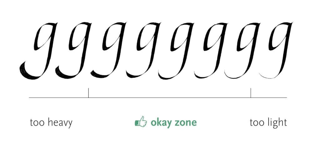
Case 3 – The tail
Remember when we discussed the weight of swashes in Part 1? Here, I want to take a closer look at one of them: the tail of the g. Its weight should match the rest of the letter, not overpower it, and not appear too fragile. The latter usually happens when the stroke gets extremely thin, but in practice, it’s much easier to go too heavy than too light.
That doesn’t mean it’s binary. There’s a whole scale of subtle variations that can work. A good rule of thumb for most letters? Avoid the extremes, unless the composition calls for it.
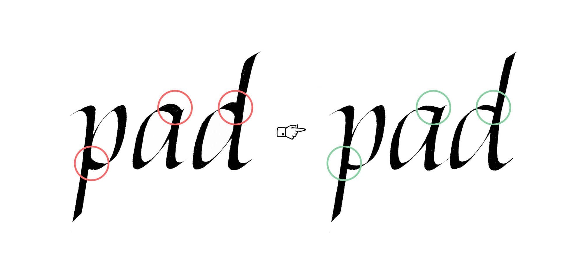
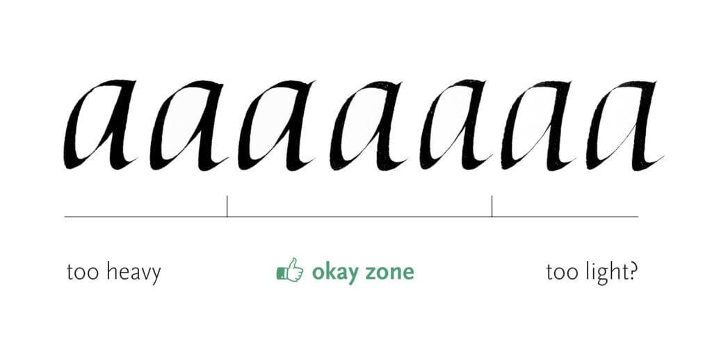
Case 4 – branching weight
This one applies to all letters with branching strokes, including some we covered in the previous post. If you want your letters to feel elegant, avoid adding too much weight to the branching stroke, especially where it meets the main stroke. It’s a similar issue to the one we saw with heavy intersections. You want to steer clear of that dense blob that disrupts the flow.
At the same time, the branching stroke needs some solidity and definition, so I try to avoid the other extreme as well. That said, a light branching stroke usually does less damage than a heavy one. (That’s why I added a question mark to the illustration.)
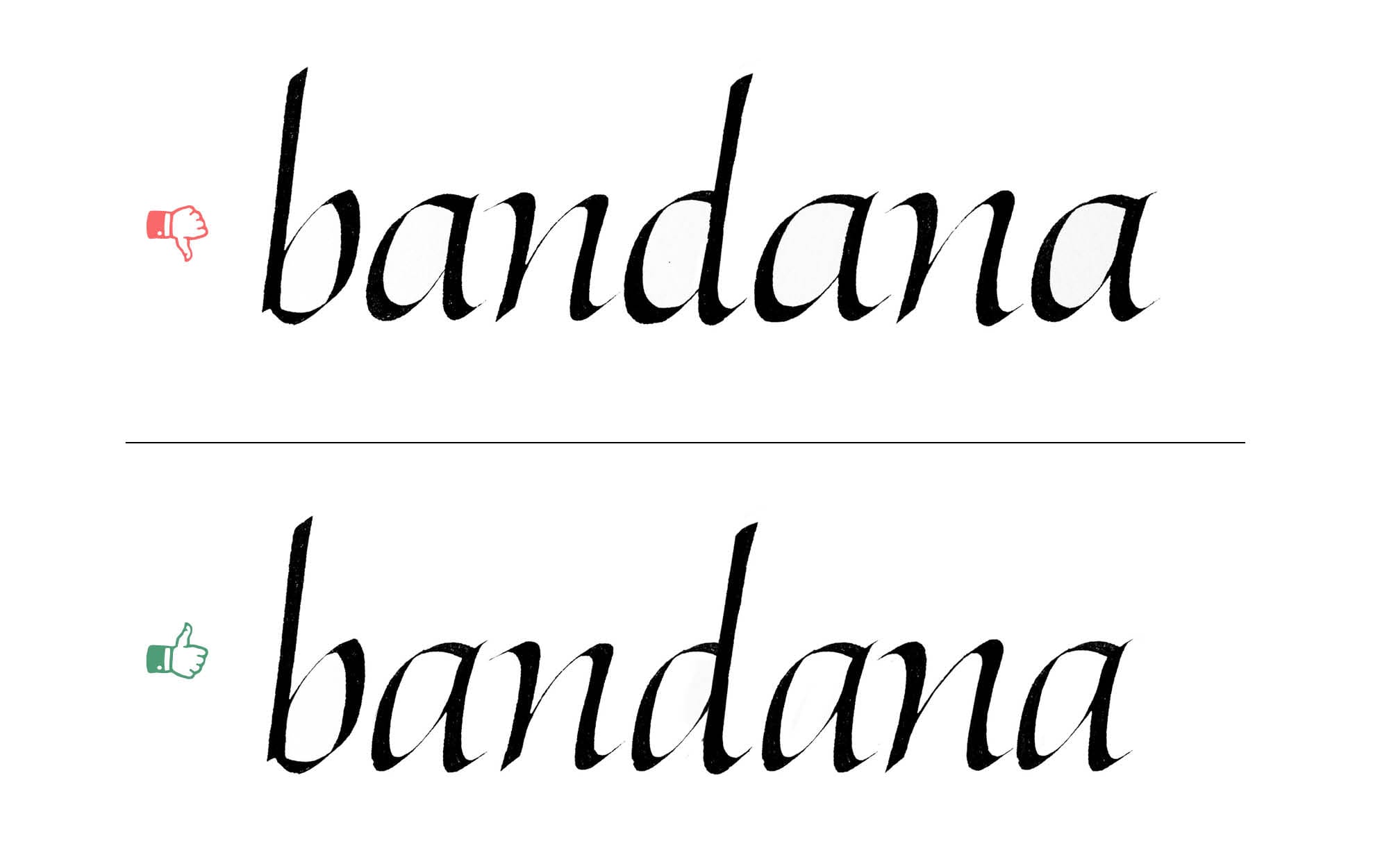
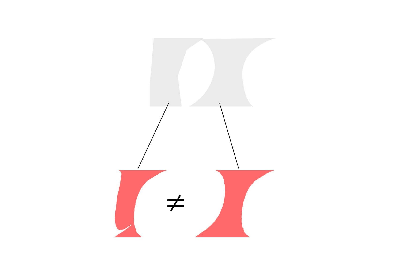
Case 5 – heavyset bowls
This mistake often comes from a misunderstanding of the bowl shapes in letters like a, d, b, and q.
If we’re aiming for the slender, elegant feel of formal italic, every part of the letter needs to support that idea, including the bowls. Beginners often make them too round, which gives the letters a heavier, more plump appearance.
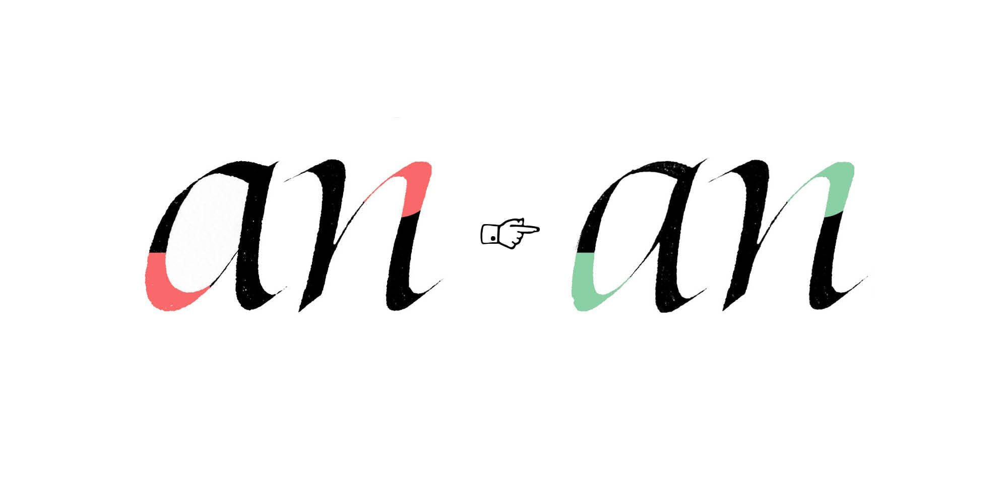
Case 6 – branching strokes
The branching strokes issue from the previous post also apply to the letters with bowls. After all, these strokes appear in most of the letters in our new group. Remember, we’re aiming for consistency of forms – or at least controlled inconsistency (but that’s a topic for another time).
Wrapping up
This concludes the second part of our Troubleshooting Italic series. In the next part, we’ll take a look at the troublesome round letters – o, c, and e.
One Comment
Comments are closed.