
Troubleshooting Italic – Part 3
This post is part of the ongoing series about fixing common and uncommon problems with Italic minuscules. So, before moving on, make sure you’ve seen the other parts. In Part 1, we established the structural foundation by examining the simplest letters. Part 2 was all about the letters with bowls, such as a, b, or p. Now, it’s time to turn our attention to the round letters – o, c, and e.
You might wonder – What? Only three letters in this group? Don’t be tricked by their apparent simplicity – these letters are full of subtle challenges that you need to worry about.
Spacing
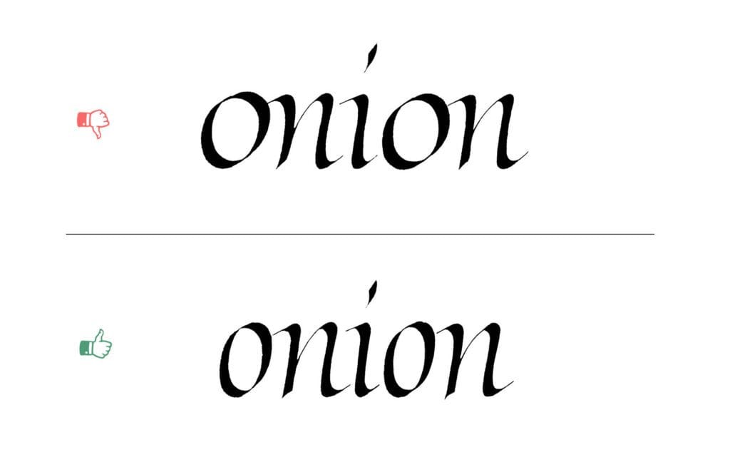
As always, I’ll start with the spacing, so here we are for the third time. The letters from this group bring even more complexity to the problem.
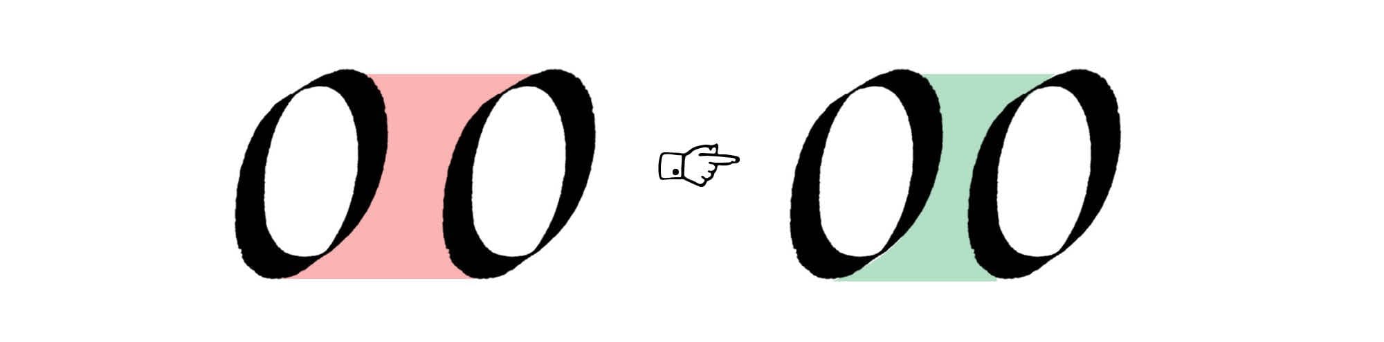
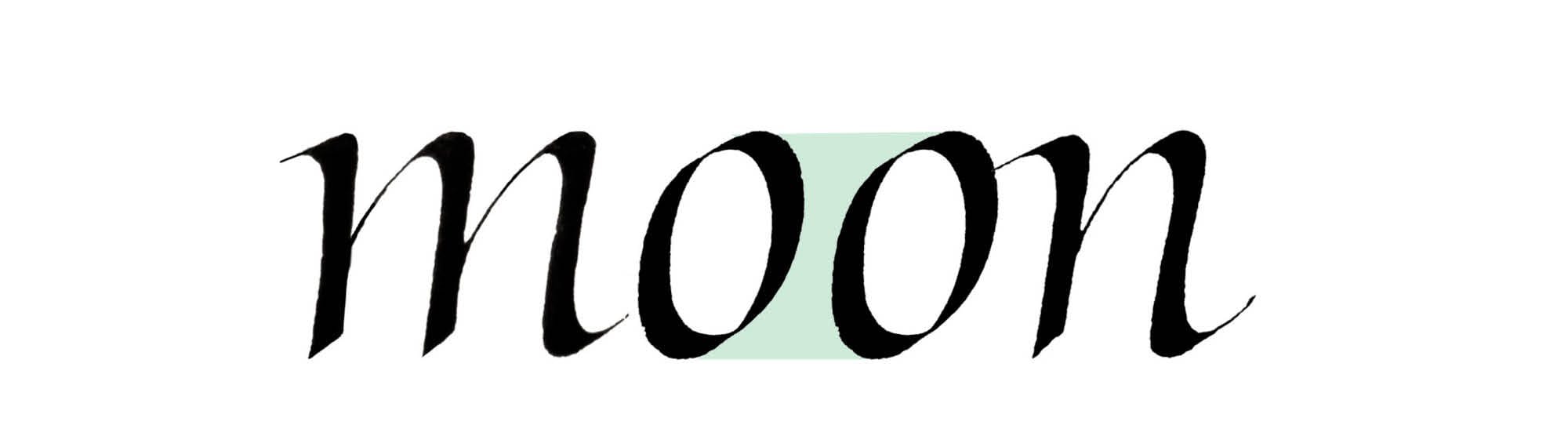
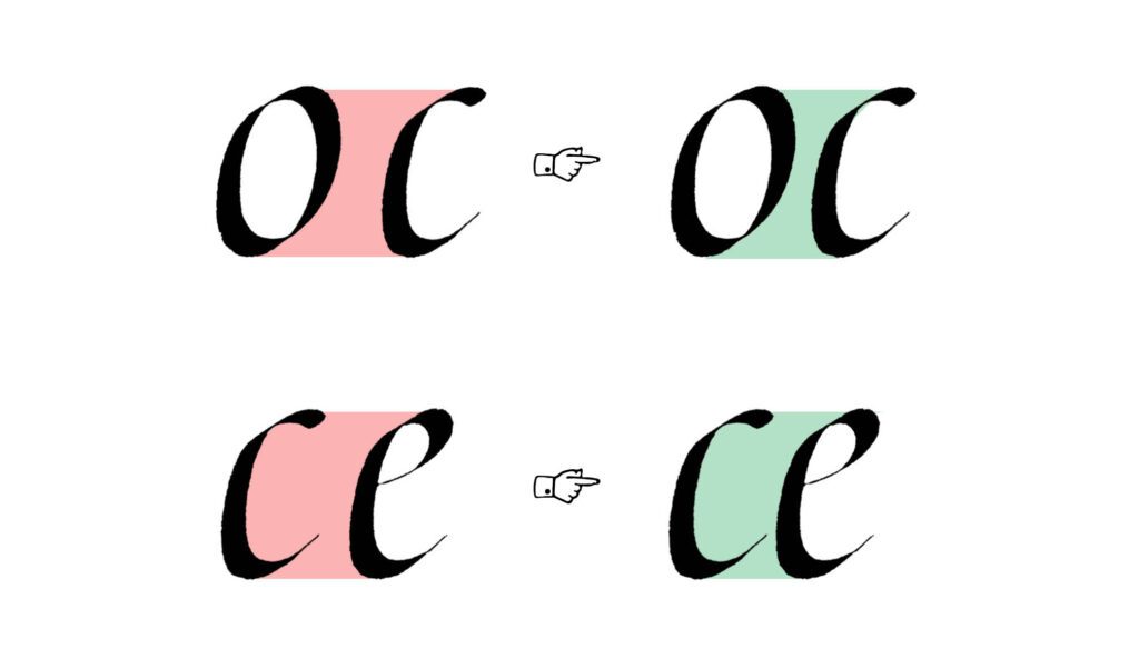
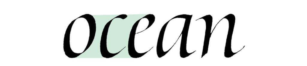
Let’s start with the simpler aspect. The spacing between two rounded letters needs to be closer, because of those additional areas above and below the curved parts. Think of the pairs like oo, oc, or oe. It’s the same problem and solution that we encountered in the previous parts when looking at the facing bowls.
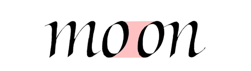
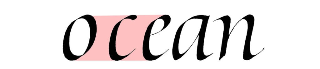
The real troublemakers are the letters with open counters – like c and e. There’s no clear division between the counter of the letter and the space between letters. Comparing the overall areas between letters is useful in most cases, but how do you do this where there is no clear boundary between the inner and outer space? Ultimately, you need to trust your optical judgment, and the only way to refine it is to practice self-criticism of your work.
Weak connections
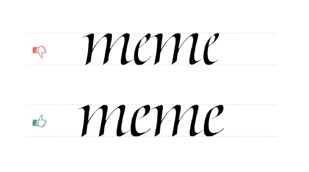
The quality of connections between strokes significantly impacts how strong and fluid a letterform feels. Overly extended, thin hairlines between the strokes are usually trouble. They disrupt the visual flow and create a sense of fragility in the letter.
Instead, aim for connections where strokes appear to flow seamlessly into one another, maintaining consistent weight and harmony. Think of italic letters as delicate but solid constructions rather than a few strokes being stitched together with strings.
Asymmetrical o
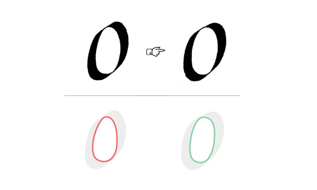
Both strokes of the o should be more or less similar. Here’s a simple test: if you rotate the letter 180 degrees, you should end up with a similar shape. The strokes don’t have to perfectly mirror each other (mine never do!), but avoid big differences.
You can simply look at the counter of the letter instead of the strokes and decide whether it’s symmetrical. Avoid the egg-shaped counter of the o! It always feels heavyweight and awkward.
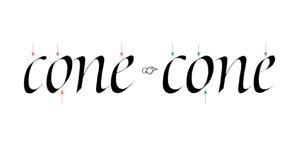
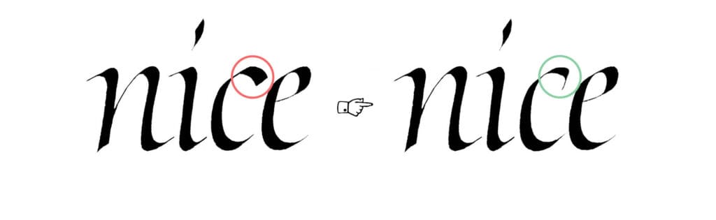
Bulky top stroke
The upper stroke of the c and e can’t overweight the entire letter. If it’s too heavy, it causes the letter to optically “roll” to the right side. On the other hand, you shouldn’t make it too light either, because then the letter feels incomplete.
It’s a balancing act, and the best solution usually lies somewhere in the middle ground between extremes.
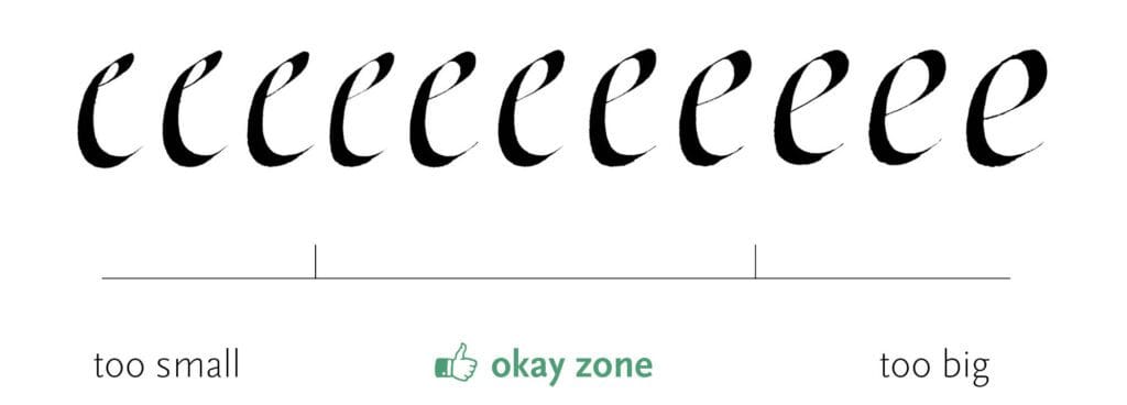
Letter too small or too big
With rounded letters, it’s very easy to lose your sense of proper scale. You can’t simply follow the guidelines blindly. The perceived size of letters isn’t just about height and width – it’s also about shape, weight distribution, and counter sizes.
Sometimes you have to slightly overshoot or undershoot the guidelines to make an optical correction. Remember – your eyes should always be the final judge. Grids and lines that you draw are there to help you, not to dictate everything that you do.
The eye
We already talked about the bulky top of the c and e, but it’s not only about stroke weight. The eye of the e – that’s what we call the e’s counter – should be properly balanced.
What does this mean? It shouldn’t catch too much attention by enclosing a very tiny space, but it also shouldn’t overwhelm the letter by being more spacious than the lower open counter. The eye should feel like an integral part of the letter.
Heavy horizontal stroke in e
Avoid making the crossbar (or lower part of the bowl) of the e too heavy. Remember what we discussed in previous posts about thick intersections? This tends to create a heavy, dark spot where the strokes connect, making the letter feel a bit too heavyset.
Keep that part in check, and the whole letter will feel more balanced.

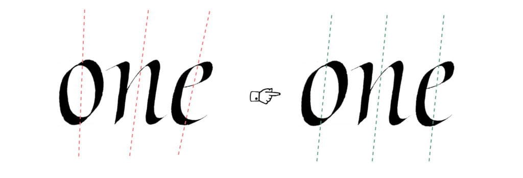
Letter missing the slant
It’s easy to judge the slant of letters with straight strokes. But it’s much trickier with diagonal and rounded strokes. You need to visualize the axis of the letter, which results from the balance of all the strokes working together.
It’s similar to forces in physics balancing each other – there’s an invisible line (the axis) running through each letter. When that gets thrown off, the whole thing becomes wobbly and unstable.
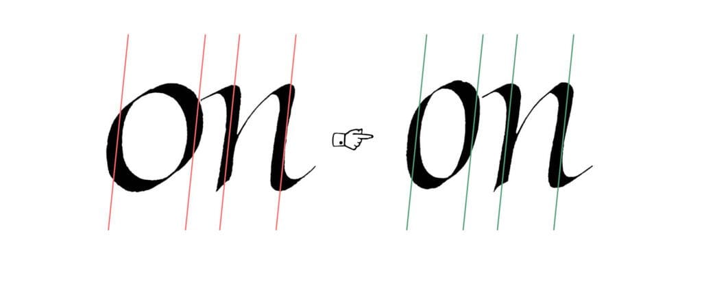
Roundness of the letters
Italic is known for slender, rather narrow letterforms. It’s easy to grasp the proportions of letters like n, m, or u, but beginners tend to make rounded letters a bit too wide. Unless you’re intentionally going for a variable rhythm (and you really need to know what you’re doing to make that work), you should aim for a consistent pace of strokes and spaces in your writing.
The easiest letter from our set is the o, so let’s focus on that. Here’s a trick I use: compare the letter o with another simple, basic form – the letter n. Put them side by side and you’ll see that a properly constructed o has a similar amount of white space in its counter. Not exactly the same, but they should feel like they come from the same family.
Wrapping up
And that’s Part 3! These rounded letters with their open counters present some unique challenges, but once you start seeing these patterns, they become much easier to spot and correct in your own work.
Next time, we’ll move on to another group that brings its own set of problems. More cases to come.
One Comment
Comments are closed.