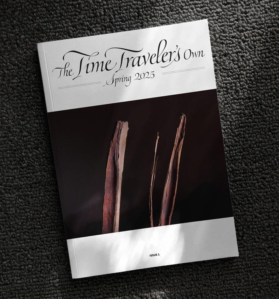
The Time Traveler’s Own
I was commissioned to design bespoke lettering for an independently published magazine titled The Time Traveler’s Own. The lettering was inspired by calligraphy. Initially, I explored various pointed pen styles for the title but ultimately decided on a contemporary interpretation of an Italic hand, incorporating cursive influences to convey the message through dynamic letterforms and ligatures
Process
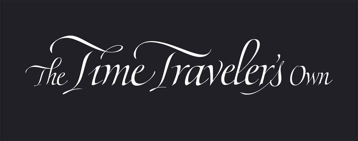
The project involved developing several design alternatives and creating preliminary sketches before converting the custom lettering into a scalable vector format. By sketching with pencil, experimenting with calligraphy, and producing early vector illustrations, I was able to identify the best design solution.
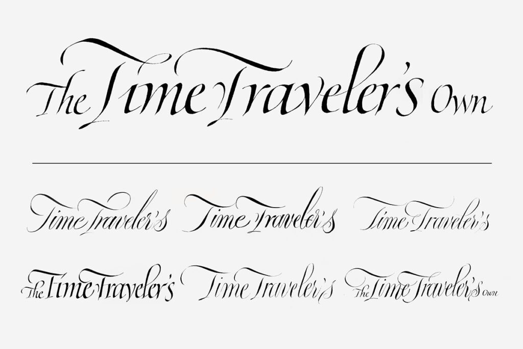
The final design
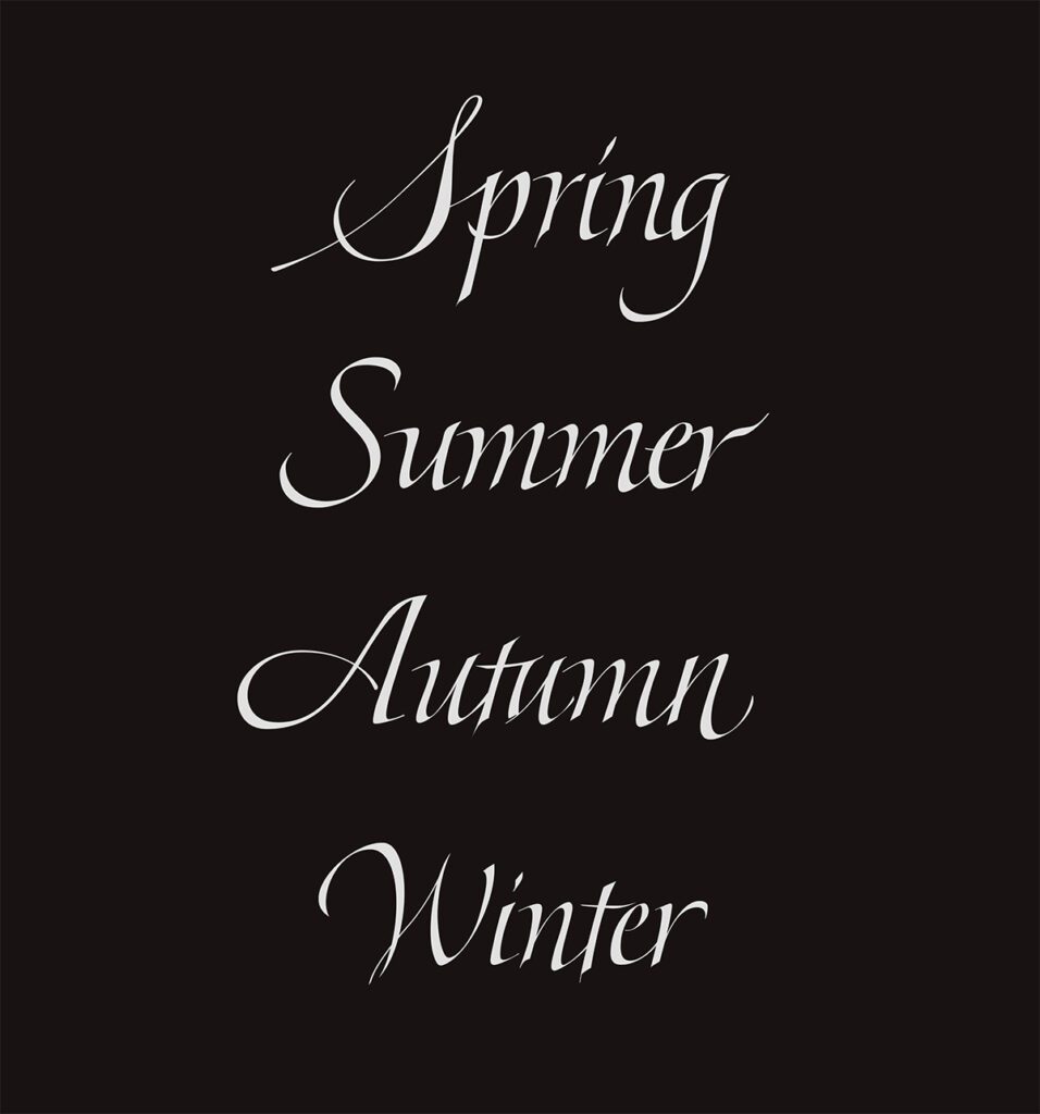
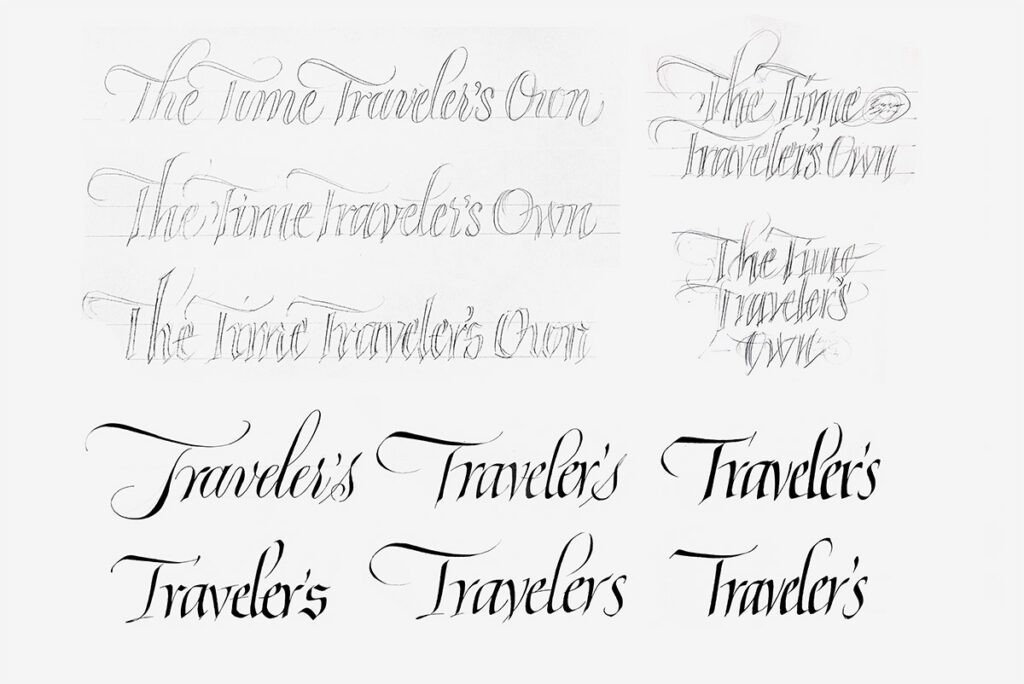
A contemporary, bespoke masthead that captures the magazine’s narrative spirit through dynamic letterforms. To support the publication’s quarterly schedule, I also delivered a matching suite of lettering for the four seasons, ensuring a consistent brand experience across every issue.

