
Troubleshooting Italic – Part 5
This post is part of an ongoing series about fixing common and uncommon problems with italic minuscules. Two of the most troublesome members of the minuscule alphabet are the seemingly innocent letters “t” and “f.” Both share a feature that makes them stand out from other minuscules, but it also introduces several new problems. I’m talking about the horizontal strokes known as crossbars. As if that wasn’t enough, there are other difficulties related to these two letters as well, so let’s break them down separately.
Spacing
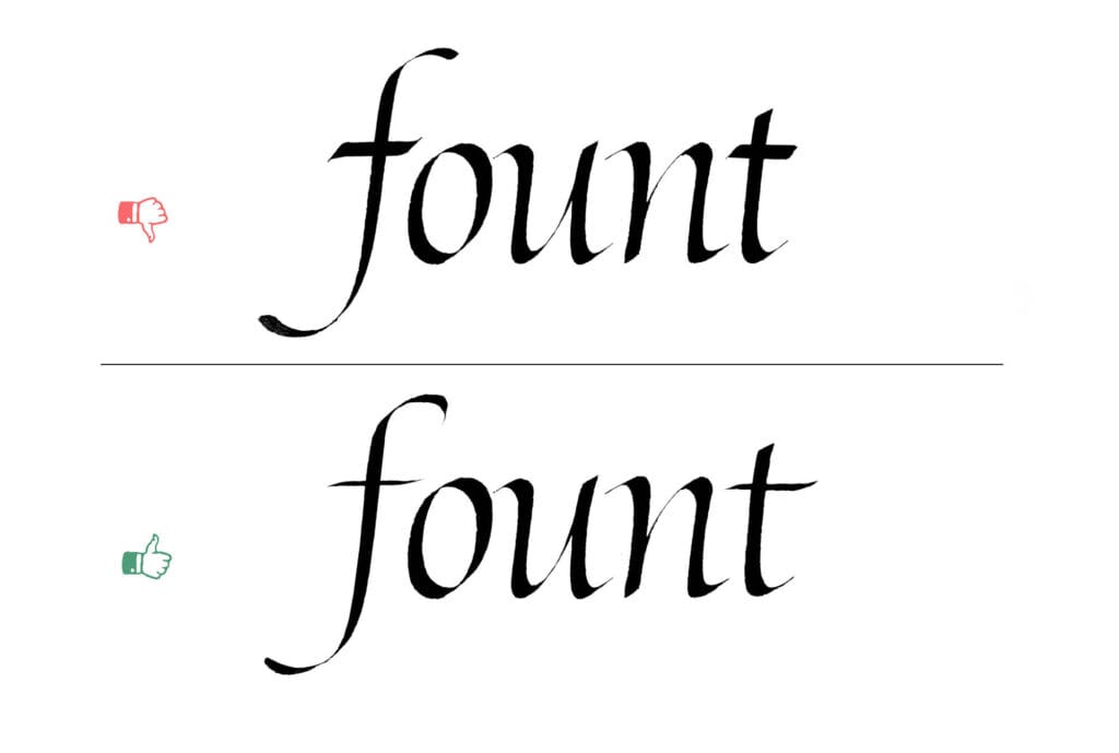
I’ve written quite a lot about spacing in previous parts of this series. Each group brought its own challenges, and as you might guess, this one is no different. The crossbar itself is the main novelty here. It often makes it difficult to position the following letter by pushing it further away. The biggest problem arises when you have to set two or more letters with crossbars next to each other.
The solution is simple: modify and combine these letters into ligatures. For those new to the term, a ligature is a combination of two or more letters merged into a single, cohesive letterform.
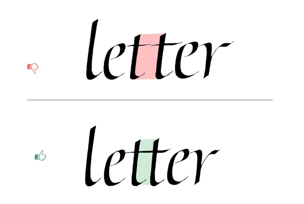
Some type designers oppose ligatures (we don’t like these people), claiming they disrupt the visual rhythm and legibility of text. While that perspective might make sense in type design, ligatures feel much more natural in calligraphy. True, some historical and language-specific ligatures, like æ, can cause legibility problems if overused. But others, such as tt or ff, solve spacing and interruption issues beautifully. In my opinion, legibility remains intact, and the visual flow is only improved by their use.
Heavyweight crossbar
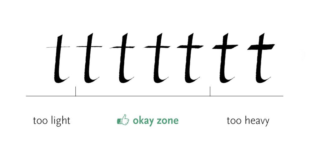
A heavy crossbar usually happens when you use the same pen angle for the horizontals as for vertical strokes. The broad nib makes thick downstrokes, so using that angle for the crossbar adds too much weight. Rotate the nib to a flatter angle for a thinner, lighter stroke. You can also adjust the pressure or rotate the pen slightly for a bit of fine-tuning.
A touch of extra thickness isn’t disastrous, but always avoid crossing two heavy lines. They create a focal point that acts like a roadblock for the reader’s eye and breaks the flow of your text. The other extreme is also not a good solution – don’t overcorrect by making your strokes invisible, which results in a weak structure of the letterforms.
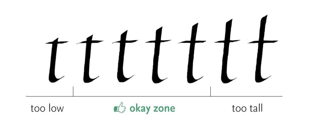
Tall t
This is a common misunderstanding among beginner calligraphers. The minuscule “t” is unique because it’s the only letter in the minuscule alphabet that extends above the x-height while still being shorter than the other ascenders. In other words, the ascender in a properly made “t” should barely extend above the waistline and should never be as long as the “l.”
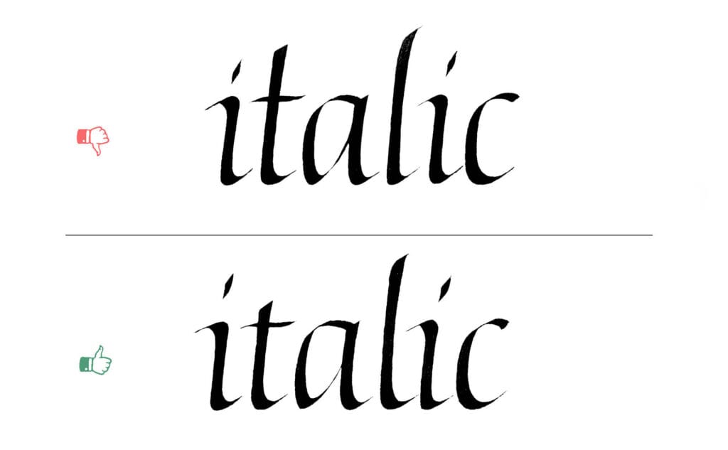
If you overdo the length, the letter starts to look awkward. Why? First, a tall “t” looks suspiciously like a sloppy “l” that got crossed by mistake. Second, it disrupts the natural rhythm of the text by introducing more ascenders than we’re used to, especially since “t” is such a frequent letter.
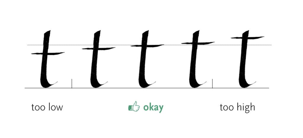
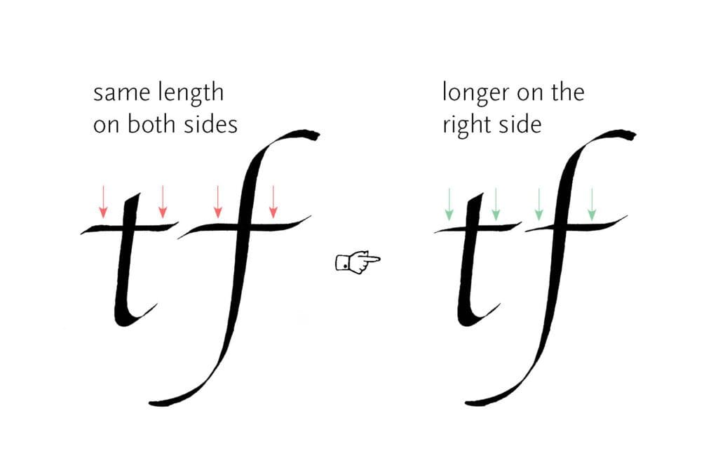
Crossbar at the wrong height
There’s some flexibility here, but the safest and most conventional spot for the crossbar is on or very close to the waistline. In less formal takes on Italic, raising or lowering the crossbar can work, but you should know what you’re doing. More often than not, it just breaks the rhythm by introducing an unexpected interruption in the visual flow.
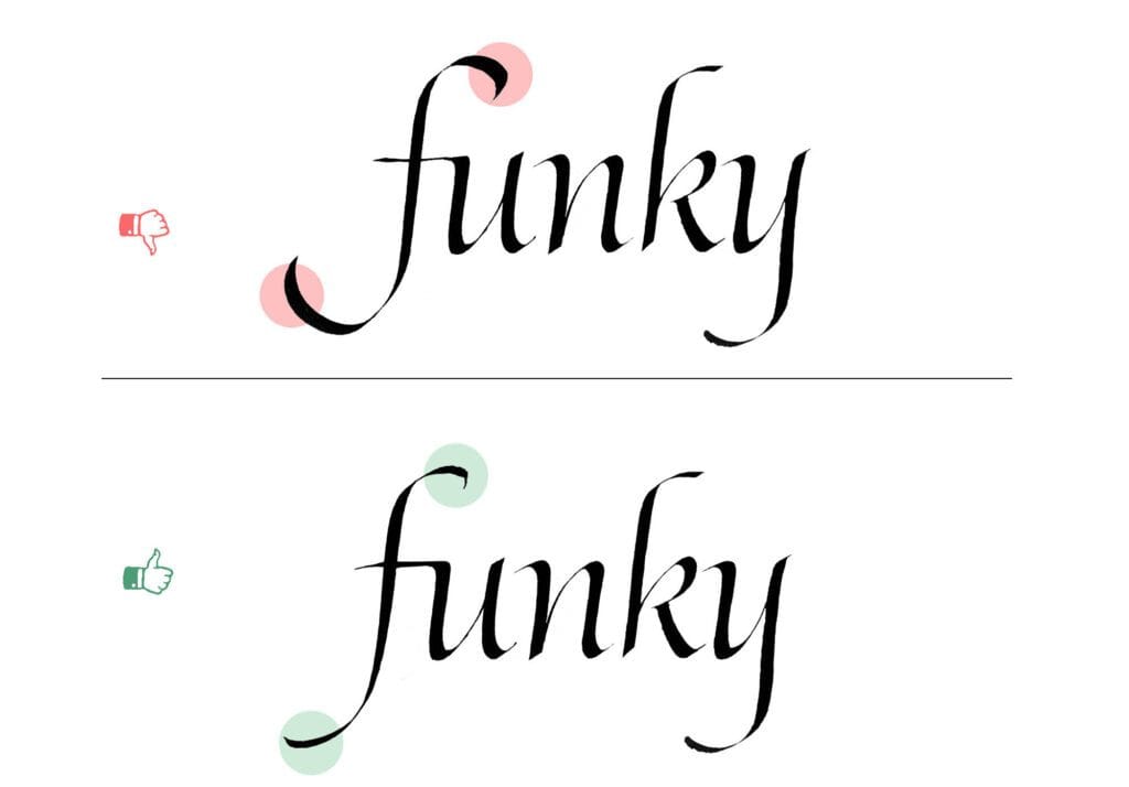
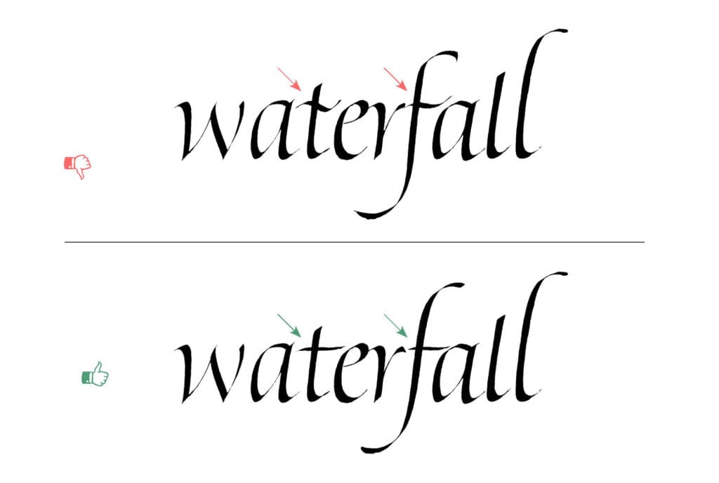
Missing the slant
The “f” consists of a long stroke capped with curves, making it the longest member of the minuscule alphabet. Because of this length, any error in the slant becomes obvious and can seriously disrupt the rhythm of your writing, unless you’re going for a more expressive, loose variation where each letter sways a bit.
Remember: don’t just stick to the grid lines. Trust your eye to balance the weight. Even a slight difference in weight distribution or a longer tail can shift the perceived axis of the letter, emphasizing the slant.
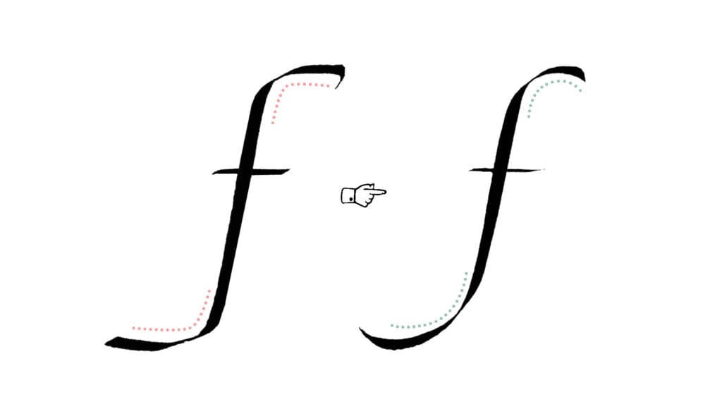
Bulky terminal
I’ve mentioned this problem before, in the previous part of the series. With the letter “f,” it’s especially easy to make the terminals too bulky because they are usually quite long. If they are too thick, they distract from the primary stroke and make the letter look unbalanced. A good terminal should be light and finish the letter without drawing attention. If you are not sure, compare its weight to the rest of the letter. If it stands out, it’s too heavy.
Smooth vs angular transition
If you aim for elegant letterforms, one of the most important, but often overlooked, features is the quality of the connections between strokes. Whether they’re angular (as in many gothic scripts) or flowing (as in our italic), they have to feel intentional to convince the viewer. Poor connections break the harmony of the letters. A long, wobbly hairline connecting two parts of a letter makes it look fragile. In italic, look for flowing, decisive connections that result from a confident gesture (and don’t confuse this with writing quickly).
Wavy crossbars
Adding a bit of curve to your crossbars isn’t a bad idea, especially when combined with some pen rotation. But exaggerating this by making the strokes wavy disrupts your writing, introducing a quality that doesn’t match the rest of the strokes. Most of our minuscule building blocks are gently curving strokes, slowly unfolding turns, and smooth connections. Introducing a wobbly stroke into this environment is like putting a square peg in a round hole.
Asymmetrical crossbars
Adding a bit of curve to your crossbars isn’t a bad idea, especially when combined with some pen rotation. But exaggerating this by making the strokes wavy disrupts your writing, introducing a quality that doesn’t match the rest of the strokes. Most of our minuscule building blocks are gently curving strokes, slowly unfolding turns, and smooth connections. Introducing a wobbly stroke into this environment is like putting a square peg in a round hole.
Summary
As you can see, there’s a lot to watch for, even in deceptively simple letterforms. In the next installment, we’ll tackle the rest of the alphabet. I’ve reserved the final part for the letters that are difficult to categorize by constructional features. Not surprisingly, they’re also the most challenging. In the last installment, we’ll analyze the trickiest of the letters in the minuscule alphabet, so stay tuned – there’s a lot more to explore!