
Troubleshooting Italic – Part 6
This post is part of an ongoing series about fixing common and uncommon problems with italic minuscules. The last group is an odd one compared to the previously covered letters. They don’t share much in terms of their construction, so each one presents a different set of challenges. The defining feature of this group is that it consists of the most difficult letterforms you’ll have to deal with (at least for me!). So, let’s take a closer look at our troublemakers: k, s, x, and z.
Spacing
If you read the previous posts carefully, you should already have a good understanding of what a good spacing requires from you. Citing Karen Cheng, a renowned author of Designing Type
When type is set properly, black letter structures are evenly distributed on a white ground, creating a predictable visual pattern.
The areas within and between the letters (rather than the distances) should be visually similar. We cannot rely solely on measurements; instead, we should match them visually, as our minds can be easily deceived by various optical illusions. Three letters in this group have semi-open counters, which complicates the task of achieving the correct spacing.
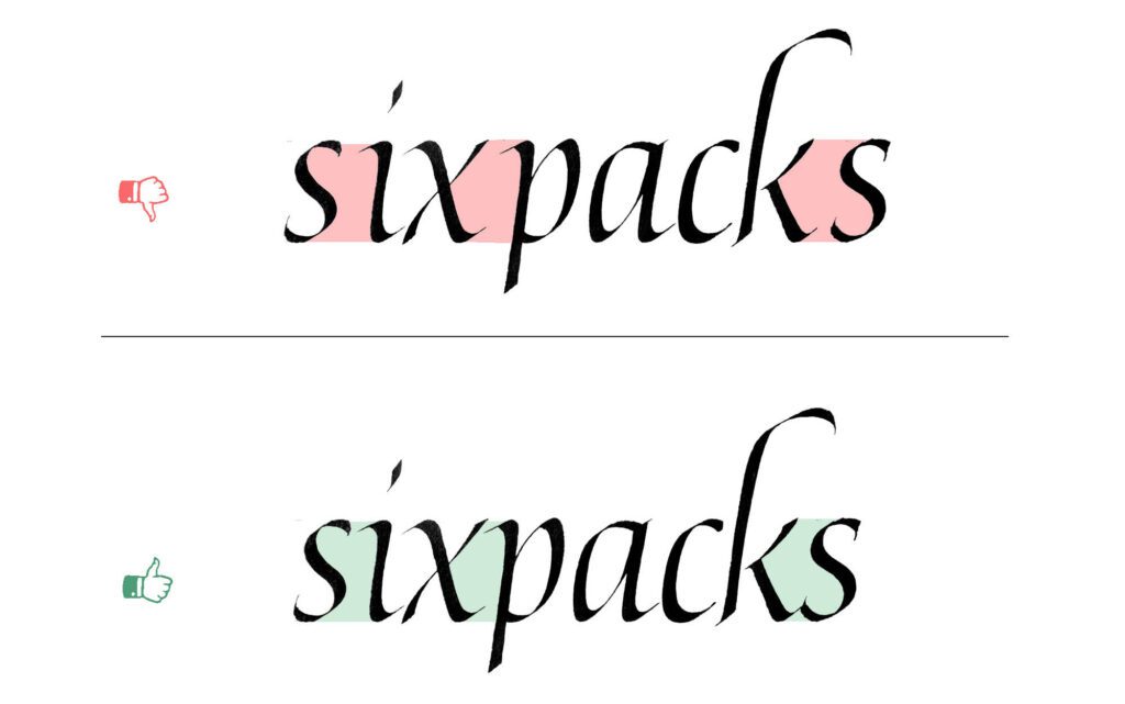
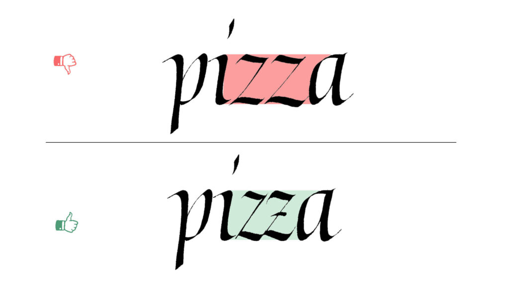
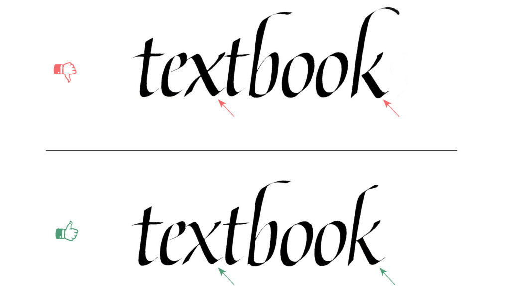
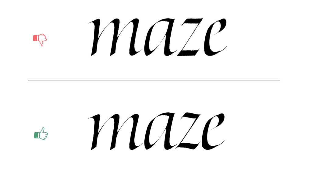
The letter “z,” in particular, presents a unique challenge; in the history of Latin calligraphy, it has held special significance, appearing only rarely in Latin. The construction of the letter, which uses a thin diagonal stroke, makes it very easy to make it too wide, thus enlarging the semi-open counters. To correct your spacing, you should remember to keep the letter narrow. You can also add a decorative stroke that will remove a bit of white space or thicken the diagonal stroke in the same way as it appears in Roman Capitals. Lastly, in some cases, the best way to manage the spacing is to use a ligature.
Balance of the counters
In type design, lettering, and calligraphy, it is common to balance the counters in double-storey letters. Ideally, the upper part of the letter should have slightly less space than the lower part. If the counters are made perfectly equal, the letters may not look quite right. Conversely, if the upper counter is larger than the lower one, the letters can end up looking quite unusual. While this approach may work for more expressive or personal styles, for formal italic, I advise you to stick to traditional proportions.
You might ask: why this correction? Rudolf Arnheim, a perceptual psychologist and art theoretician, explains that objects in the upper part of our field of vision are perceived as heavier. Thus, a letter with mathematically equal parts will not feel optically balanced. For this very same reason, we raise the crossbar in a capital H slightly above the mathematical midpoint. We have to apply this same logic to our minuscules, which is why the upper sections of the s and the k must be visibly smaller than the bottom
Managing Diagonal Strokes
As we discussed in our exploration of letters like v and w, diagonal strokes present their own unique set of challenges. Unfortunately, these tricky diagonals also appear in the letters within this group.
If you recall from previous parts of this series, keeping your pen at the usual, constant angle will cause the thick diagonal strokes to appear far too heavy. To alleviate this problem, we need to rely on a bit of pen trickery, which means rotating the pen.
For example, let’s look at the leg of the k. There are a few different ways to approach this, but I like to rotate to a flatter pen angle as I pull the stroke down, and then turn it up slightly just before reaching the baseline. The letter x is a bit more forgiving. When writing its main diagonal stroke, I like to start at a flatter pen angle. This matches the entry angle used for letters like i and n, helping us to maintain visual consistency across the alphabet. Immediately after starting the stroke, rotate your pen to a steeper angle to reduce the thickness of that main diagonal.
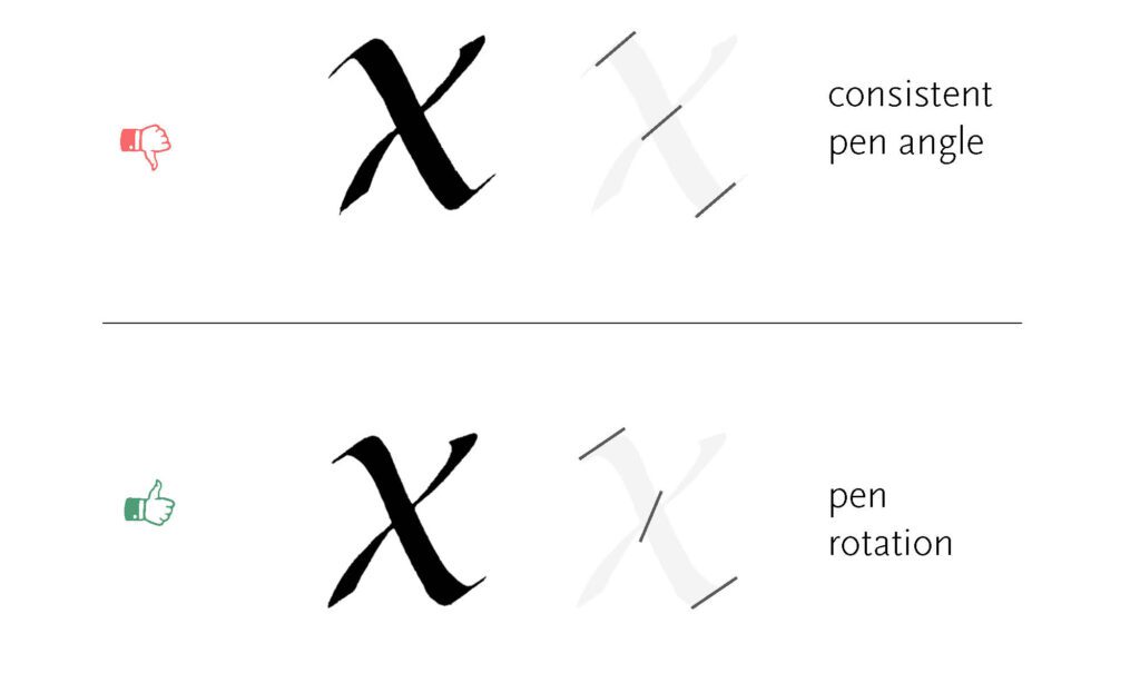
If you are a beginner, simply keeping a constant pen angle is perfectly fine! Calling it a “mistake” isn’t entirely justified. However, once you get more comfortable handling the nib, it is highly worth considering introducing this rotation technique. It will allow you to achieve much more refined and elegant letterforms.
Heavy strokes
Another general mistake that can easily throw your letters out of harmony, in much the same way as miscalculating counter sizes, is adding too much weight to the upper parts of the letters. To be clear, I am referring to the upper parts within the x-height, rather than the ascenders.
When you place too much visual weight at the top, the letter becomes top-heavy and loses its stability. Within our current group of troublemakers, this usually manifests as an overly heavy arm in the letter k that dominates the rest of the form, or a noticeably heavy upper stroke in the letter s. Keeping a close eye on the thickness of these upper strokes is essential for maintaining a steady visual rhythm.
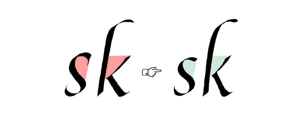
The congested k
Because these letters are so different from the rest of the alphabet, and even from each other, they tend to invite very specific mistakes. Let us start with the letter k. One common issue I often see is making the letter look a bit too congested by heavily overlapping the strokes on the right side with the main stem.
What I mean here is the triangular shape formed by those two right-side strokes. If you overlap them too much with the main straight downstroke, it creates an awkward dark spot, making the entire letter feel clunky and heavy.
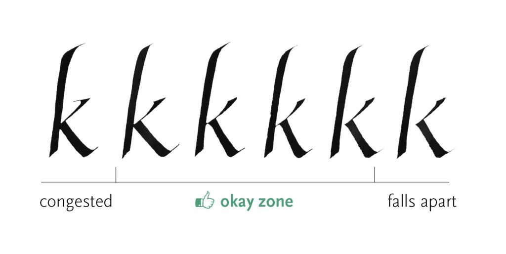
To fix this, it is usually better if the right triangle just barely touches the main stem. You also have a couple of other elegant options to resolve the junction. You can connect it using a short hairline, simply extending the first thin stroke slightly to bridge the gap. Alternatively, you can leave the triangular right side completely separate from the stem. Allowing for a small gap between these parts of the letter invites a bit more breath and lightness into the form, which is a stylistic choice I personally prefer.
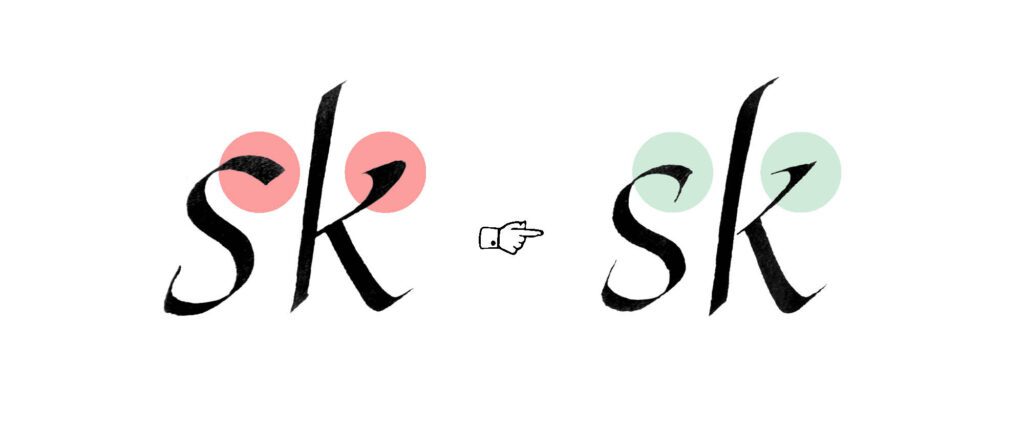
The cramped s
Another letter that easily gets a bit too cramped is the troublesome letter s. It can be very tempting to dramatically curve the upper and lower strokes inward. However, if you do this, you will significantly reduce the aperture, or the openness of the letter. This makes the form appear too dark and ultimately results in an uneven shade across your text.
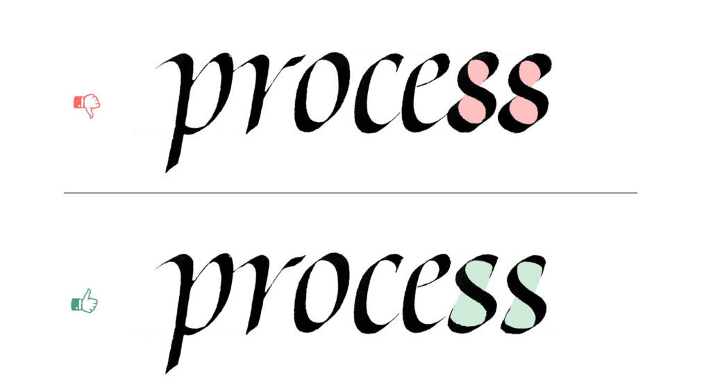
I have found that a much better approach is to slightly flatten the path of the upper and lower strokes, curving them inward only very gently. By keeping these strokes a bit more open, the letter breathes better on the page. If you still feel the need to engage the negative space within those counters, you can simply add a serif rather than over-curving the main strokes themselves.
Dealing with Poggendorff
As an additional note on achieving perfect balance, let us look at a highly refined detail in the letter x. It is easy to assume that the thinner, right-side diagonal stroke should be written in one continuous movement, but what gets in our way is the so-called Poggendorff effect, which causes the line to feel optically misaligned. In type design, there is a specific optical adjustment that fixes the problem.
This adjustment involves breaking the continuity of that thin stroke, meaning you actually write it in two separate movements. Instead of aligning both halves on a perfectly straight line passing through the main diagonal, you adjust them slightly so the lower half sits a little bit higher.
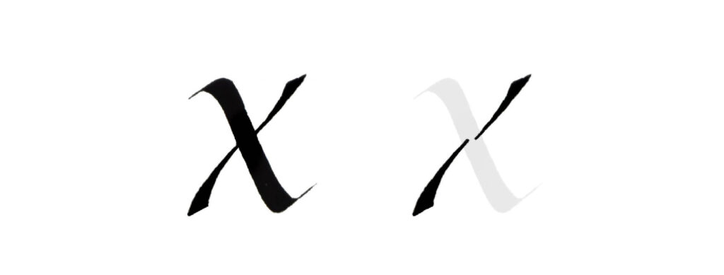
Not only does this subtle offset trick the eye into seeing a perfectly balanced form, but it also makes the letter much easier to execute. Writing two shorter strokes requires less sustained control than pulling one long, continuous movement across the page. Skipping this is certainly not a mistake, but rather a far-reaching level of refinement. If you are a lover of details like me, you might really enjoy applying this approach to your letterforms.
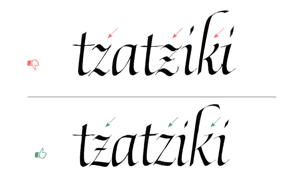
The Flat Z
I also want to point out another small, common mistake related to the letter z: making the upper and lower strokes completely flat. The tricky thing about this problem is that it only becomes visible within the context of other letters. Because most other minuscules are either rounded or pointed at the top and bottom, they only touch the guidelines at a single point.
If you construct your z with what are essentially two flat rectangles sitting completely flush against the waistline and the baseline, the letter will optically appear to be much taller than the rest of your alphabet. To avoid this optical illusion, we want to add a little bit of diagonality and waviness to those strokes so they do not sit entirely flat.
However, notice that I emphasize adding just a little bit. In fact, you have to be very careful with this adjustment, which brings us to another common trap…
Excessive waviness
A very easy and tempting mistake for beginners is adding too much waviness to the letters. This usually happens when we want to introduce more decorative aspects to our writing. However, overdoing it really only results in naive-looking strokes rather than the elegance you are aiming for.
Let us look at a couple of specific examples. The upper and lower strokes of the letter z naturally have a little bit of curviness to them, but it is important not to overdo this. Similarly, the leg of the k should be only very slightly waved. It absolutely should not be wiggling and kicking in all directions.
This restraint comes down to the fact that we want to achieve a very specific feel within our work. If you are practicing formal calligraphy, your letters should feel confident, elegant, and refined. Wiggly, exaggerated strokes simply do not build up to the effect we want to achieve.
That’s it! We have officially dealt with the most challenging letters within the italic minuscules. Since this troubleshooting format has met with such a warm reception, I am definitely going to continue the series. There are still plenty of topics within italic to cover, and a whole world of other styles to explore together.