
Troubleshooting Italic – Part 1
This post kicks off a new ongoing series focused on refining your Italic minuscules. Think of it as a troubleshooting guide – designed to help you identify and correct common issues that affect clarity, rhythm, and style consistency in your calligraphy.
Let’s start with a useful perspective: A mistake is only a mistake within a certain context. In Western calligraphy, the most frequent design-level mistakes relate to the three core issues:
A mismatch between letterform and literary theme
Typographers understand this well: a style is only as appropriate as it fits the text it represents. Just as Comic Sans doesn’t belong on a gravestone, a historic Gothic Textura with all its anachronisms may feel out of place in a futuristic context (unless adapted). Dissonance can be a valid artistic choice, but it should be intentional, not accidental.
Inconsistency within the visual theme
Formal calligraphy demands legibility and structural harmony. Informal scripts offer more expressive freedom. Beyond that, each style carries its particular requirements. Italic, for example, has specific historical models and visual logic that guide its construction. Letters must feel like they belong to the same visual system.
Misalignment within the compositional context
A letterform might be beautifully executed in isolation, yet feel out of place in a word, line, or layout. Type designers solve this with alternates and ligatures. As calligraphers, we have the advantage of flexibility and real-time adjustment. That’s what keeps calligraphy dynamic: it’s a constant balance of adaptation and invention.
We’ll primarily focus on the second and third categories – mistakes rooted in visual inconsistency and compositional imbalance. These are often subtler than technical issues like ink flow or paper quality, but they’re just as critical for your work.
That said, from time to time, I’ll introduce some issues related to technique and materials as well, but it won’t be my main focus.
This first installment examines the most basic letters: i, n, m, l, j, h, u. They are grouped by structural similarity. We’ll look closely at common problems in their construction and explore practical ways to correct them.
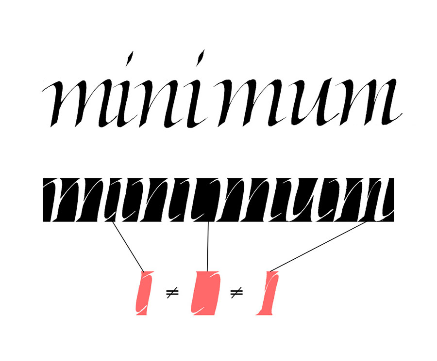
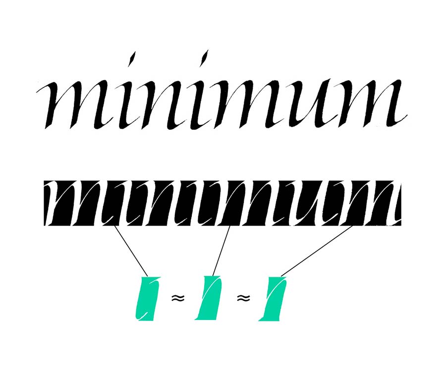
Case 1 – Troubleshooting uneven spacing
This is a big one – not just for this specific group of letters, but for all of calligraphy. You’ve probably heard that the spacing should be consistent. But what does that mean?
First, it’s important to understand that spacing can’t be measured by the physical distance between letters. Instead, think of it as creating an even distribution of negative space – the space between and around the strokes.
Achieving that consistent rhythm requires a balance between the counterspaces within the letters and the spaces between them. Every detail plays a role: the length of a serif, the taper of a stroke, even the texture and density of the ink. All of these can subtly shift how the spaces feel on the page.
That’s why spacing can’t be reduced to a formula. It’s not mechanical – it’s visual. It’s a skill built through observation, sensitivity, and ongoing practice.
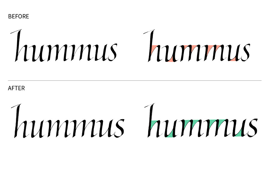
Case 2 – branching consistency
Many Italic letters include branching strokes, like the exit stroke on n. One of the most common problems here is inconsistency. Varying shapes or angles break the rhythm and disrupt the script’s internal logic.
Subtle variation can add liveliness, but the branches still need to feel like part of the same system. Look closely at the negative spaces they create, and aim for consistency in both shape and size to maintain an even visual rhythm.
Case 3 – The tittle
The tittle, which is a fancy typographic term for the dot above letters like i and j, should complement the letter, not overpower it. At the same time, it needs to be visible, so it shouldn’t be too light or faint either.

The same principle applies to accents and other diacritical marks: they shouldn’t feel like separate additions. It’s not just about matching weight, they should be made of the same visual components as the letters themselves. Shapes, line quality, contrast, and weight all matter.

Case 4 – clumsy swashes
When writing Italic with a 45-degree pen angle (a common recommendation), the top swashes can easily become too heavy. Watch their visual weight, and consider lightening them to keep the overall form balanced and refined. A lighter touch or a slight adjustment to the pen angle can help you soften the stroke without losing character.

Case 5 – Inconsistent turning points
The transition from a hairline into a vertical stem, or from the stem into a hairline, can vary in both shape and weight. It can be gradual, angular, pronounced, or subdued. These turning points play a significant role in shaping the overall tone of a letter. You can observe them in entry strokes, exit strokes, and in the shoulders of the letters (like in the n-arch).

The potential mistake arises from not paying attention to these shapes, which can lead to weak forms or inconsistency. Think of it as the way the curve carries weight into or out of the letterform. Pay attention to how the stroke flows, how the weight shifts, and how the transition is shaped. You might want to emphasize these parts of the letter or keep them more subdued. Either way, the key is consistency.

Wrapping up
And that’s it for the first part of our Troubleshooting Italic series. More cases to come in the following posts. In the next installment, we’ll look at letters that include bowls and the common challenges they present.