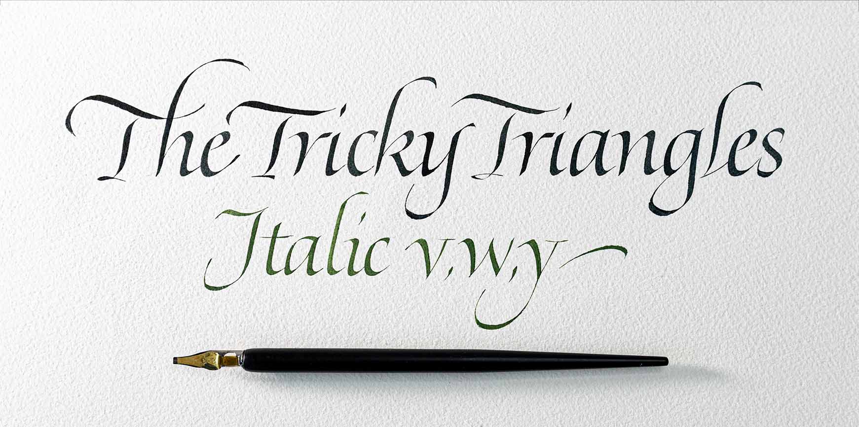
Troubleshooting Italic – Part 4
This post is part of the ongoing series about fixing common and uncommon problems with Italic minuscules. This time, we’ll approach the tricky triangular letters. I’m talking about v, w, and the alternate form of y. We’ll be dealing with diagonal strokes, which bring their own challenges.
Spacing
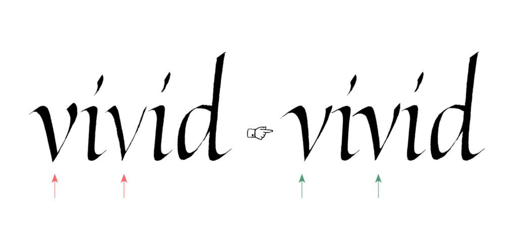
We’ll start with spacing again, and believe me, these letters are among the most challenging when it comes to establishing a clean visual rhythm. Similar to the round letters from Part 3, the triangular letters have a considerable amount of white space around them. Their triangular shape leaves more space near the baseline, with wider counters at the top. The right-side stroke is usually lighter than the left, which also affects the spacing.

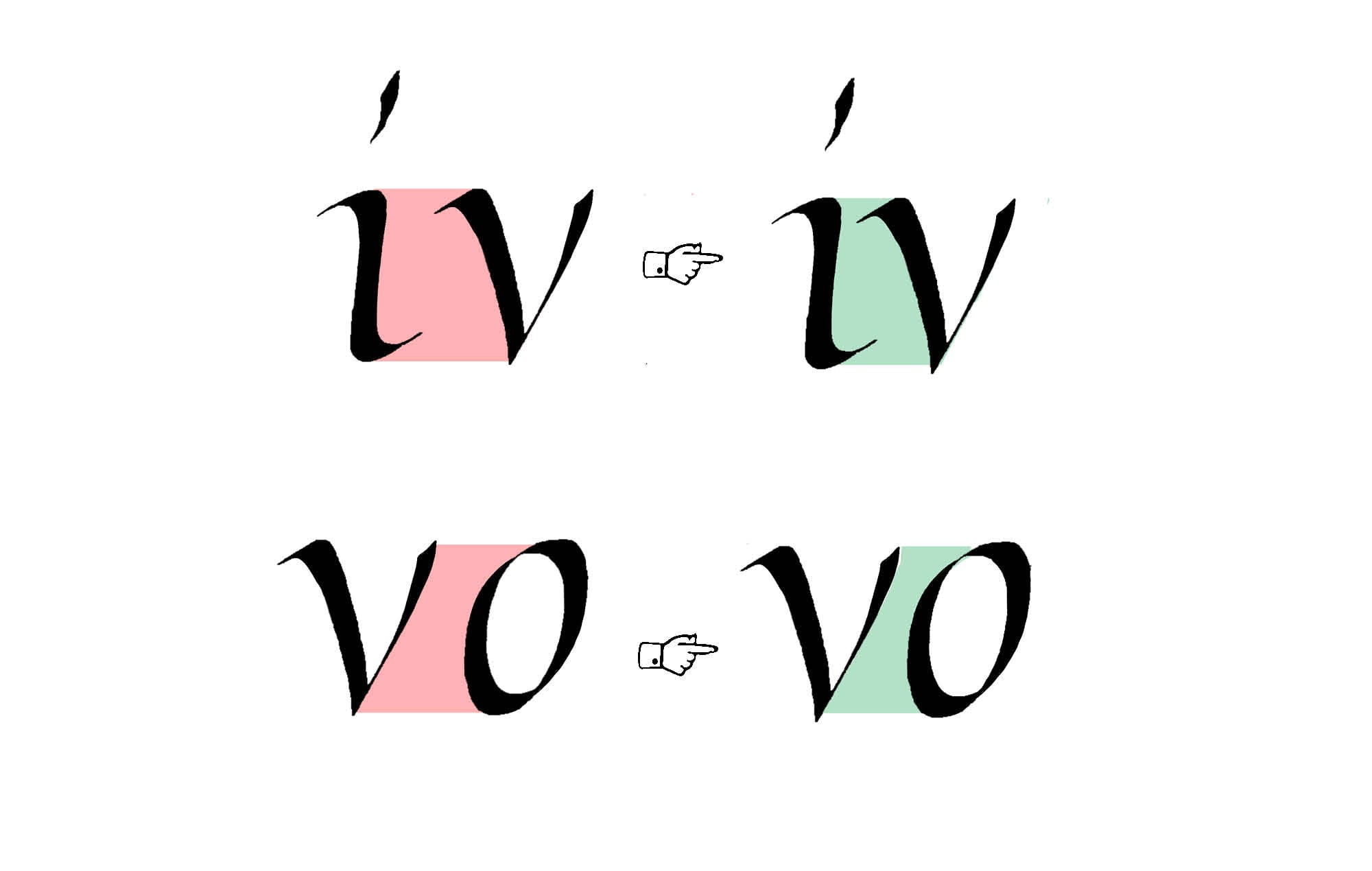

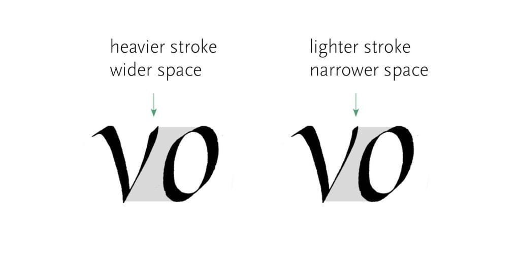
Because your right-side stroke can have a different weight than mine, you may want to make extra adjustments. Depending on how light or heavy you write it, the following letter should be placed closer or further away.
Stroke Thickness
Another challenge lies in the weight of the diagonal strokes. If you stick to the same pen angle as for the vertical strokes, you might end up with a stroke that feels bulky – and we don’t want that. The solution to this problem is often to adjust the pen angle to a steeper value. A more effective approach is to use pen rotation. This means changing the angle as you write the stroke by shifting the pen in your hand. It’s pretty tricky to use, but it’s an essential technique if you want to elevate your calligraphy.
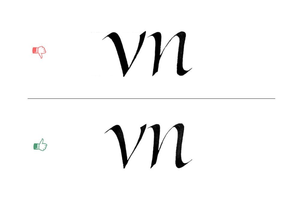
Note that I don’t provide the exact pen angles here. They’re dependent on the slant of your Italic, which may be different than my example. It’s better to think in terms of steeper/shallower angles and thicker/thinner strokes than to focus on mathematical values.
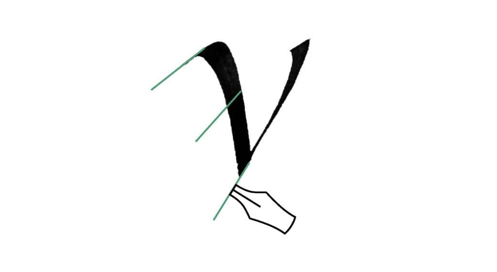
The right-side stroke is trickier: it should be lighter than the left, but not so light that it looks fragile compared to its neighbours. If it’s too heavy, it dominates the letter, and if it’s too light, it gets lost and breaks the rhythm. Judge it in context and aim for a v that still feels like it belongs to the same family.
Width
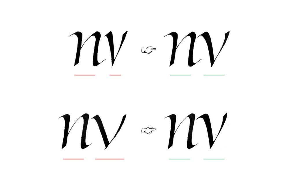
In letters with parallel strokes (like n), it’s easy to sense the proper width of the letter. The v, w, and y pose more problems. Look at the balance between the counter and the outside space. It should create a similar visual rhythm to what you find in other letters.


Slant
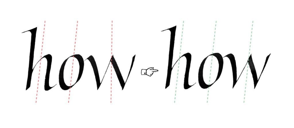
Another big problem is aligning the letter to the proper slant. You can easily see the slant in letters like n, but it’s trickier with our triangular group. Think of the slant as the resultant force created by your diagonal strokes. In the letter w, the slant of the inner triangle is most important and determines whether the letter follows the axis of the script.
Ligatures and Modifications
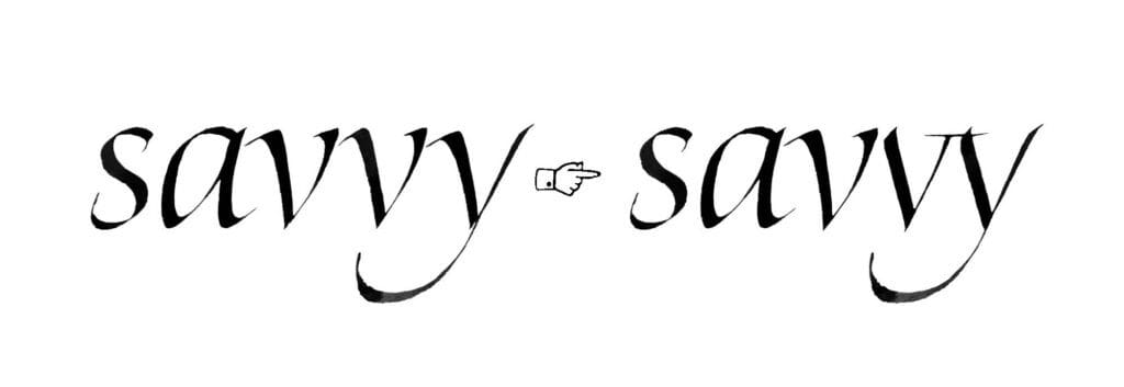
We already discussed spacing, but some cases are difficult to resolve simply by adjusting the distance between the letters. In pairs like rv or vv, it becomes increasingly difficult, and you might need to resort to ligatures to make it work.
Joins
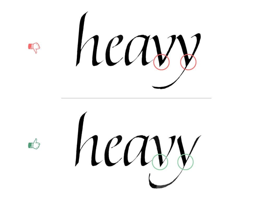
In Part 2, we already discussed the need to avoid heavy joins. Similarly, the connection in the lower part of the triangular letters should be fairly light, so it doesn’t add too much bulkiness. The right-side stroke doesn’t need to be a hairline, but avoid letting two heavy strokes overlap. To fix this common problem, keep the connection light enough that the letters don’t become bulky, while remaining solid.
Overshoot
Triangular letters behave differently on the baseline. Because their apex sits at a single point, v and w can appear to be too high if you place them directly on the baseline. Lowering them slightly corrects this illusion. With y, the tail balances the shape, so you don’t need to make the same adjustment. The effect is amplified in heavier variations of Italic.
The key point: be extra careful not to place triangular letters too high, because the effect will be exaggerated compared to other letters. It’s better to let them sit a touch lower than to risk them floating above the baseline.
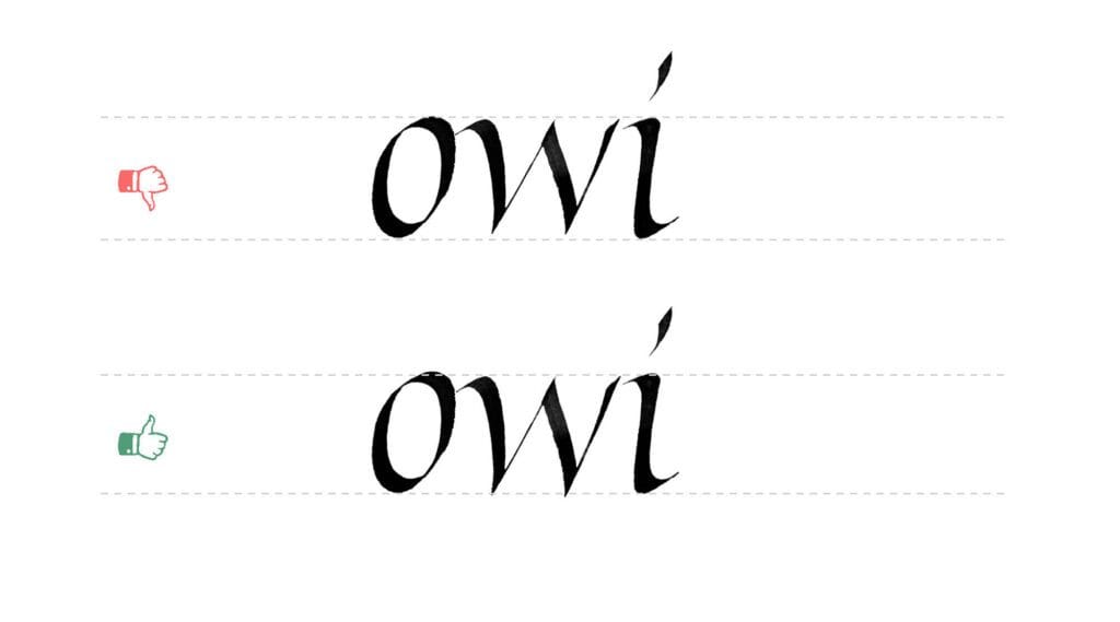
In type design, this correction is called the overshoot, and means an adjustment of the placement of your letter on the baseline. Tobias Frere-Jones explains this in depth in his article, The Optical Illusion That Tricks Our Brains Into Perceiving Typeface Letters Are of Equal Height.
Wavy strokes
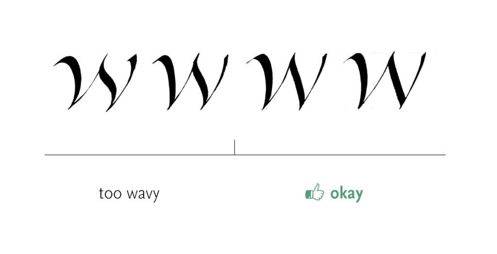
The third stroke of the w can be given a gentle wave, but beginners often overdo this, which results in a wobbly, uneven form. If your Italic isn’t meant to look playful (which can be valid in some contexts) and you want an elegant, consistent feel, the strokes should resolve in a smooth, gradual manner. Few things disrupt rhythm more than a sudden wobble. This principle extends beyond w: a touch of waviness in swashes can be expressive, but if exaggerated, it creates the same problems of imbalance and broken flow.
Wrapping up
And that’s Part 4! We’ve tackled some of the trickiest triangular letters: v, w, and y, and explored how spacing, stroke weight, width, slant, and rhythm interact to keep them in harmony with the rest of the alphabet. In the next part, we’ll look at t and f. Just two letters, but with their own unique set of challenges.

